Saturday, October 16, 2010

Artist in Residence Week

Nature In Art Museum and Art Gallery

What a great week I had at as Artist in Residence (AIR) at the Nature In Art Museum and Art Gallery in Gloucestershire. Usually I have, for quite a few years now, shared my week there each year with fellow artist and very good friend Julie Askew. Unfortunately due to her own working commitments she was unable to do her stint as AIR this year. So another friend and fellow artist, Frances Whitman, kindly let me and the sculptor Linda Heaton-Harris muscle in on her week.

I stayed with Frances and her husband all week, which was lovely as I was spoilt with accommodation and good home-cooked food all week! We had good weather, despite horrible weather forecasts saying it would be otherwise and each day we were inundated with visitors. Many familiar faces came to see us and we met a lot of new and interesting folk too. If any of you are reading this... many many thanks for coming to see and talk to us and we hope you enjoyed seeing our work. After setting up on Monday afternoon, it was back to Frances' house to have a quick bite to eat and tidy myself up as I was giving a talk on my work at the zoo to the Wallsworth Art Group in the evening.

It's too much fun to be work!

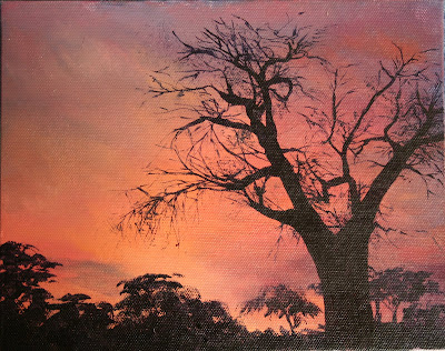
Then on the Tuesday it was time to settle to some painting, in between chatting to my fellow AIR's and the folks who came to see us. I decided to try out a new medium (to me) during the week - water mixable oil colours. I have these in mind to take on my Africa trip early next year, so I wanted to try them out. I started first with a simple sunset on the first day- great for slapping some colours on and seeing how they mixed and blended. I found them much the same as normal oil colours.. except for the novelty of using water to wash the brushes in and for thinning the paint when necessary. Took me almost all week to get over that little amusement. Having produced a sunset I was happy with I let it dry overnight and put a very dark purple silhouette of some trees onto it the next day. The drying time is somewhat shorter than normal oils, but I was still able to work on the wet paint for about a day before it started getting a little too tacky. It dried to the touch in about 3 days and by the end of the week the sunset was completely dry with the paint well set.


The trees didn't take very long to do so I spent the rest of the day drawing up a camel and rider for the next stage in playing with the new paints - something with a little more detail and precision. In 2008 I visited the Pyramids of Giza and took many photo's and some video of the camels and riders... I loved the look of them.. almost regal in a way.. so I had in mind a painting or two.. hence all the photo's. Now was the time to paint one. The background was done on Thursday and I decided to go with a strong dark colour to make the camel and rider stand out against it. The original reference has too much clutter behind and the colours were very light making the subject disappear into the picture. I want this piece to be about the camel particularly and so the background needed to be simple yet have movement in to reflect the camels movement and my choice of colours came from the blanket under the camel's saddle. The camel was started on Friday - hindquarters first. The front of the camel was done on Saturday and the blankets and camel bridle with pompoms on Sunday.
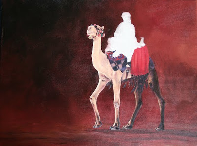

Since getting back home after our AIR stint ended on Sunday, I have been looking at and mulling over the dark hindquarters of the animal. It was worrying me. So I spent some hours on the internet trawling through countless pictures of camels and reading camel information... seems the camel I photographed is very unusual. Of the, what must be hundreds of, pictures I viewed I found only two or three photo's of a camel with darker hind-quarters than the rest of the body.... and some info regarding the old tradition of killing camel calves with dark hair mixed in with the lighter hair. Maybe this is why camels tend to be one colour over the body whether it is white, blonde, tawny, brown or black. They had been selectively bred to be of one colour.

SO....... though my colouration is accurate to the original animal.. it is not typical, from what I can see. Therefore for the painting make more sense to the viewer, I will now re-paint the hind-quarters to look like a normal camel.
Whilst looking through all those photo's I also decided that I will add a few more decorations to the camel's attire and the suggestion a visitor made to cover the rider's face is growing on me. A few had commented that the background looks like a swirling dust storm that the camel is emerging from... so covering the rider's face would enhance this suggestion... liking this idea more and more.

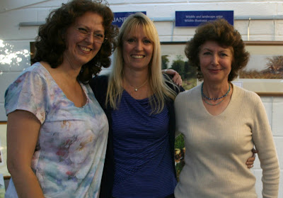
Myself with Frances and Linda

Despite missing the "normality" of doing my AIR week with Julie, I had a great time with Frances and Linda, both of whom are lovely, happy and fun ladies. We laughed so much during the week and by the end it was strange to think that we had not been friends for a long time. Great week- the company, weather, visitors, venue and food - all superb. Thanks to all.

Saturday, October 02, 2010

Artist in Residence - Nature in Art

I am busy preparing for next week, when I will be at the Nature In Art Museum and Art Gallery in Gloucestershire as one of the Artists in Residence from Tuesday 5th October until Sunday 10 October.

This year I shall be sharing the studio with another good art friend, Frances Deakin and I am looking forward to a week of drawing and painting, meeting new and familiar faces as well as her company.

If you are in the area we would be very pleased to see you if you fancied popping in. The Museum has a very nice little coffee shop where, as well as snacks and beverages, they also do lunches.

I am also giving a talk (on Monday evening) to the Wallsworth Art Group on my work as the Wildlife Illustrator at Bristol Zoo Gardens, so I'm looking forward to that also.

Please click on the title of this post to go to the Nature In Art website for more information on the Museum.

Saturday, August 07, 2010

Gloucester Arts and Crafts Summer School Part 2

By the end of the week I could play a little with the wax myself so I did a couple of demo pieces.

The first is just a pattern idea and the lioness could have done with another colour "layer" before I put the darkest tone on, which is a little too dark for my liking. Ah well...

I may use both as a book cover for a large hardback sketch pad I have - one on the front and t'other on the back.

Gloucester Arts and Crafts Summer School

This was my third year tutoring batik at this wonderful event and yet again it proved to be another great week of creativity, fun and food. I mention the food, as it the catering as always was superb with lovely meals and cakes throughout the week.

Jenny, Del and Hazel returned for another week’s worth of “punishment” with me (their third year each – are they mad?), it was so good to have them back in my class – not only from the social aspect, but their creativity is a delight to see. They came armed with ideas and knuckled down to produce some fantastic pieces. Having been on this week with me in two previous years they knew what they were doing and yet again amazed me with their productivity and creations.

Two new ladies joined us, Shirley and Gill, neither of whom seemed too sure of what they had signed up for; but they tackled the challenges full on and I was really pleased with how they progressed. Shirley had a plan to create some patterns for her patchwork quilting and she produced two large pieces that we all loved, but were dismayed that her plan was to cut them both up into smaller pieces! Gill came with a great attitude of no matter what happened she was going to give it a go and enjoy herself… I think she achieved that. And for someone who was sure she was not at all creative or could not draw… what she produced dispelled that theory for me. I think she surprised herself and it was good to hear her say that at the beginning of the week she never thought she’d produce what she had by the end of the week.

I could not decide which of their pieces to post, so I have gone with all of them.

Thank you to the ladies of my class for being such a fun bunch to spend a week with around hot wax pots and noisy hairdryers, for coming to my class and for being so generous.

Friday, August 06, 2010

Creating distance in a painting

My general method of working on a painting tends to be a progression from the ‘distance’ towards the foreground. Rather like a stage with a backdrop and scenery in “layers” coming towards the audience.


So I start, in this case, with the sky and use three subtly different tones of blue. Working wet into wet I put a warm dark tone (French Ultramarine and a touch of Alizarin Crimson into the Titanium White) to the top coming down to the cooler mid-tone (Cobalt Blue and Titanium White) with a very pale greyish-blue tone (French Ultramarine, Alizarin Crimson and Cerulean Blue into the White) at the horizon; blending the colours with a soft filbert brush so that there is no ‘noticeable’ banding. The effect is quite subtle and although it will not be immediately obvious to the eye, it will help create a sense of distance to the horizon. I finish off the sky using a ¾” soft Mop Brush with the lightest of touches – barely touching the paint – but just enough to “feather” out any visible brush strokes. By softening my brushstroke lines I create a smoother feel to the paint and in this case makes the sky appear seamless and distant.

I paint in the hill whilst the sky is still wet enabling me to get a soft join of sky and land, as a strong hard edge of the hill against the sky will bring it ‘forward’. I want the hill to also look distant, so I need the colours to be muted and the detail to have a soft focus look. I use a base of Titanium White and add Burnt Sienna, French Ultramarine and Alizarin Crimson to get a brownish mauve for the right hand-side ground colours and shadows and add Gamboge, Yellow Ochre and Burnt Sienna to white to get creamy colour mixes for the more sunlit left-hand side. When I mixed my sky colours I made sure I had more than I needed for the sky, as I want to use them in my hill colours too. This helps “tie” the two together to create unison in colour tone and aids the hill colouration to look distant. Using a Size 4 Round watercolour brush I roughly block in the lights and darks of the hillside. Then I go over again paying more attention to building up the textures within the colours, sunlit and shadow areas before I add the vegetation.

For the trees and bushes I use mainly cool bluish greens made from Ultramarine, Cerulean Blue, Cadmium Yellow Hue and Yellow Ochre with a few warmer greens here and there made with the same blues but more of the Yellow Ochre and a touch of Burnt Sienna. For the vegetation highlights I used the pale creamy ground colour and a pale peachy colour made from Titanium White, Alizarin Crimson and Yellow Ochre. Again I use the sky mixes in with my colours to get the unity in the tone of the painting.

Tip - As I paint around the elephant forms I take care not to have any thickness of paint or ridges. If left, when dry and the ellies colours are added, this will distract from the feel of the elephants being in front of the landscape.

For
the thin strip of water at the base of the hill I use the sky colour but add more French Ultramarine to darken it a little more. At the far water’s edge I blend in a thin line of brownish blue with the greens of the reeds to indicate shadows and a touch of white blended in towards the front (bottom) edge of the water to indicate the light sky reflected. Coming forward of the water I start with the greens of the vegetation and reeds making them slightly darker than on the farther edge… again all to add a sense of depth.

As I move forward from there towards the line of the elephants’ feet I use white, Gamboge and Alizarin Crimson to make the greens paler and warmer, so the vegetation appear drier. I am not putting in any detail but using the brush strokes and colour to indicate form and texture. Once past the lush vegetation at the water’s edge I use more peachy/pink, mauve and cream/beige colours in with much paler greens to add warmth and help create a look of parched, dry grasses and land.

I add the shadows cast on the ground by the animals using a purple-brown colour and adding greyish green and pale blue to indicate lights and darks within. Although the shadows are thin lines adding a few fluctuations in tone and colour breaks up their starkness. I work downwards on the canvas (coming forward in the scene) in stages; sky, hill, vegetation, water, vegetation, soil and grasses until I reach the elephant’s feet.

After each stage I use the Mop Brush as before with just the lightest of feathering sweeps over the wet paint. This keeps detail to a minimum, gives a soft focus effect and smooths out any ‘light-catching’ ridges and bumps in the paint that might draw the eye and distract from the sense of distance I want to achieve.

Now onto the elephants themselves and where the real fun starts. By this time several days of work have gone by and the background is mostly dry so good strong edges to the animals can be created. The creams and peachy/pink colours I used for the dried grasses and ground colours I now use as the highlights for the animals. Elephants often are similar colours to their environment as they use the soil to mud-bathe and dust themselves with.

The soil in this part of Amboseli is very light in colour, so the tops of the ellies reflect this. The lower parts of their bodies (and the whole of the youngster) are darker, indicating that they have been in the marsh and the lighter soil has been washed off. The tide line is about mid way up the adults’ sides, so the lower parts of the elephants are darker greys. The colour mixes I used for this are a dark and a lighter purple mixed from French Ultramarine, Cobalt Blue, Burnt Sienna and Alizarin Crimson mixed with some of the sky blue and a little Titanium White. A darker purple brown is used for the shadows. And a mid and a light tone warm grey and a bluish purple-pink (a pale warm grey with cobalt Blue and Alizarin Crimson added) is used for the main body. The shadows for the animals are much richer in colour and warmer in tone than those in the vegetation behind them; this brings the animals forward in the scene and distances them from the hill and land behind.

The first animal I paint is the one furthest away and has the most light on it, so it will set the tone for the rest. I carefully block in, starting with the darkest shadows of the underside of the body and head and tops of the legs. The mid tone grey covered the rest of the legs and body. Using the darkest purple brown I mix it into the wet mid tone grey on the lower half of the body and the pinkish blue on the upper part of the body leaving the top of the back, shoulders and head for the pale cream and pinkish landscape colours. I blend the colours into each other moulding the body using the brushstrokes to go in the direction of the wrinkles and ‘round’ the animal’s form.

Again the detailing on the anim
al isn’t great it’s mostly implied. Being aware of the direction of brushstrokes when creating the wrinkles and moulding the body is key to the effect. Using a brush loaded with a darker or lighter tone than is on the canvas and drawing it through the wet paint creates lines, which easily imply wrinkles. Adding a few high and low lights emphasises the effect.

I add in a few touches of a mid green that was used in the landscape on the bottom part of the body and upper legs… not too much, just a hint. On the legs, particularly nearer the feet, I add a pale mauve into the dark shadows to imply reflected light from the ground. On the
parts of the legs catching the light I add a little of the pinkish mix and a touch of pale blue on the feet to make the bottom of the legs look dustier than the tops. Once finished, I use the Mop Brush again to soften the colour blends, but then go back over to add one, or two, more defined lines. Once the paint is dry, I use a dry brush stroke to gently go over a few areas of the body and legs with a few of the colours previously used to add a bit of rough texture to the skin.

I painted the elephants one at a time in the same way, working from the furthest to the nearest one, but making the tones slightly darker on the nearest animals, again to bring them forward and create a bit of space between them and the animals behind. For the foreground I again kept the detail loose as I want the focus to be on the elephants and any sharp detail in front would draw attention away from them. The colours are the same as I have used throughout for the grasses and ground but I added a little more burnt Sienna and Alizarin Crimson to the mixes to strengthen the tones and therefore bring them forward in the painting. I also used a Size 0 Rigger brush to flick in some longer grasses. The bleached branches and twigs have the purples and pink tones from the elephants and cream tones from the ground.

Once I had finished painting the foreground I took a long hard look at the painting as a whole and decided to take out several of the dead branches as it looked too cluttered and also added some dust kicked up by the elephants. The dust was added once the painting was dry and using dry brush strokes I scrubbed an uneven thin application of the pale mauve and pink mixes around the feet and then used the Mop Brush to soften and lift out any areas of too much paint.


And that, as they say, is that. Painting done and I was pleased with how it came out. I really enjoyed doing this one. Of course there are always bits you feel you could have done better/differently but then us artists are rarely completely satisfied with our work and are usually our own worst critics.


Ambling by Observation Hill

Back in May I posted a bit about an article I did for the Artist and Illustrators magazine. I promised to post an more in depth article here on how I created depth in the painting. My apologies that it has taken me so long to post it... I hope it's a case of better late than never.

I have split it into two parts.... as it really is quite long. This post is about the inspiration for the painting and the start.

"Ambling by Observation Hill"


The Inspiration

This was a commissioned piece of work, with the specific request that it will help fund a trip for me to go to an elephant conservation project in Botswana with the aim of raising funds for their research by having a future exhibition of my paintings of the area and animals in it. Elephants were requested, which I was very happy with, as this seemed the natural subject choice.

For this painting I wanted a calm, relaxing scene of elephants just going about their daily lives with a bit of interest in the landscape, but not too much as I wanted the focus on the animals. I recalled a visit to Amboseli National Park in Kenya some years ago where the landscape was mostly flat with a few hills and of course the magnificent sight of Kilimanjaro across the border in Tanzania. I loved the colours in the pale soils and drying grasses, the varying light of the sun on the landscape at different times of day and the contrasting richness of vegetation and greens of the marsh areas.

We saw many herds of elephants and had some wonderful sightings, mostly just going about their daily lives unperturbed by the “canned” humans in their smelly, noisy metallic cages. When the engines were switched off and everyone fell quiet… the sounds of the landscape filled the senses. As I write this I find I am closing my eyes and reliving that wonder. A truly wonderful place... and that was the feeling I wanted to convey in the painting.


The Start

I watched my video recordings and looked through my many slides and photographs from that trip looking for ideas of landscapes, references for the elephants and remembering the feel of the place - colours, sounds, smells, temperature of breeze etc. I chose not to do Kilimanjaro in the background - wanting instead something more personal to me and also to the client, whose daughter (now a very good friend) had been on that very same trip. Observation Hill fitted in perfectly with my “vision”
for the painting compositionally and personally – our little group had a picnic breakfast on the top of it one morning, looking down watching animals move by… including elephants. So I hope that when my friend's father looks at it, he sees not just a hill in the background but a place where his daughter has stood and enjoyed a great view.

I spent sometime drawing up the elephants to try to get proportions and the animal anatomy to my satisfaction. And then transferred these to separate bits of tracing paper to play with the composition of the grouping, abandoning several proposed elephants from the group, until I found something that seemed right and would “flow” across the canvas. Then I played with the landscape moving the position of the hill around, up and down, left and right, bigger and smaller until it fitted my ellie group and ca
nvas shape. Once happy I made a final outline drawing on more tracing paper and then transferred it to the canvas.

After drawing in the elephants in more detail on the canvas I applied a thin wash of purple acrylic over the surface. By coating the canvas with a thin wash of acrylic I not only fix the pencil to stop it lifting and mixing into the paler colours as I start painting but it also takes away the dreaded expanse of whiteness that can be intimidating to start painting over. My colour choice of the wash depends the final painting, I tr
y to use a colour that “grounds” the final piece – for this one it was pale purple but for another painting I might choose, sepia, burnt sienna or an orche colour wash.


What I used

Canvas - 24”x12” stretched cotton medium grain

Paints - Oils: Windsor & Newton - Titanium White, Alizarin Crimson, French Ultramarine, Cerulean Blue, Cobalt Blue, Burnt Sienna, Yellow Ochre, Cadmium Yellow Hue.
Van Dyck Ferrario – Gamboge.
Acrylic: Windsor & Newton – Windsor Violet, Burnt Umber, Crimson.
Brushes –Sizes 1 and 4 round watercolour, Size 0 Rigger, ¾” Filbert, ¾” Mop
Artists White Spirit
For this piece I used oils ‘straight from the tube’,
without any other medium such as linseed oil or Liquin (I never use the former) and apply it in a thin opaque layer. My oil brushes are a mix of watercolour and acrylic, both old and new.

My Palette of colours!


Saturday, June 05, 2010

Sketching morning

Now that I have got over the initial flurry of work at the zoo, I can now start up my 'training' sessions again. The zoo is keen on staff developement, but it is quite tricky for me to train at art specific to my job at the zoo... I can think of quite a few workshops etc that I could do to improve my art, but that is not related strictly with my zoo job... alas! So my boss and I came up with the notion of my training being free sketching mornings once a fortnight. This is so that I can go sketch what ever I want, rather than what I need to do for an upcoming job. The freedom of this is wonderful.

This week I decided.. as my primate drawing skills have always been a little rough.. that I'd go sit in the Lemur Walk-through enclosure and try and get something done in there.. it helped that it was a lovely warm day.
So I sat for just under 3 hours in the delightful setting of the enclosure watching mongoose lemurs and ring-tailed lemurs... and, of course, sketching. I was pleased that despite a long gap on my sketching mornings, I did a lot better than I had expected.

When I know I have a few hours for sketching.. I pick on one animal subject and concentrate my focus there. Flitting between several species rarely makes me feel like I've achieved what I want from the process of a sketch. I want to try and learn/understand how they move, sit etc and it takes a good few hours of observation and sketching for me to feel as though I've given myself that chance to achieve my goal.


Once I've got myself settled in front of my subject I start with some time spent purely observing.. taking in mental notes of their form, behaviour and where they like to be doing certain
activities. Then I usually start with quick thumbnails of just a few lines to get the feel of body shape and how limbs, head and tail relate to it. Then I start adding more - I rarely go into great detail 'til much later in the session, if at all. Then I might pick on a feature (such as hands and feet) and concentrate on trying to understand the form of that.

Here's a couple of pages from that morning's session with the lemurs.


Two of my latest zoo paintings

Thought I'd do a couple of updates about what I've been up to at the zoo since April, when I started back after my 3 months off.

As usual there was the checking and replacing of faded and damaged ID signs as my first priority and then it was to set about the rather large pile of ID requests waiting for me on the desk!


First one to be done was a painted colour image of an orange headed thrush, then a detailed pencil drawing of a yellow mongoose head which was particularly enjoyable to do.


And then a series of fish were painted... Flier cichlid, white striped catfish, tinfoil barb and I'm almost finished on a kissing gourami.

This is the white striped catfish.. I'm really pleased with this one as it started out quite badly but I dug my heels in and persevered. The difficulty of this fish was to make it look shiny.... I'm told I have achieved this but I'll leave you to make your mind up.
This is a closer view of the fish, many times bigger than the original... look closely at the body and you'll see the range of colours that I have used on this shiny silvery grey/white fish to try an achieve the glistening shine.


I paint a heavyweight watercolour paper with a black... a black that does not come staright out of the tube. I find tube blacks tend to look a little 'dead' so I liven a lamp black up with Alizarin Crimson and Ultramarine. I then transfer the outline of the finished fish drawing onto the black and use a series of thin base coats to start building up the body of the fish. I leave all the fins including the tail til after I have finished the body.

In the case of this fish I used a bluish grey overlaying with thin coats of greenish grey, yellowish white, and washes of darker blues and greens. The patterning is a dark purple/mauve intermixed with a more 'foggy' dark blue.
With dry brush strokes I brush pinks, yellows, pale greens, mauves, light blues across the body.. this is to try and replicate fractions of light hitting the smooth body of this particular fish. As a finish to the body I use a small amount of white, knocked back a bit with yellow, to apply in dry brush strokes to create the highlights and with a thin bluey white wash I paint over the fish to 'round' the body, in particular its head and underside.
Once I'm satisfied I have the body as good as I can get it, I put on the fins. This is generally done with a thin wash of a pale blue and stroked in in the direction of the rays and structure of the fin. I add lighter colours to accentuate the rays and more 'fleshy' areas of the leading edge and base.

The copyright on these images belongs to Bristol Zoo Gardens.

Saturday, May 08, 2010

Artists & Illustrators Magazine; Masterclass Feature

I was recently asked if I would like to do the Master Class article for the June issue (out now) of the Artists & Illustrators magazine. This particular issue is a Wildlife Art Special with contributions from a number of prominent and famous wildlife artists, so I am particularly pleased and proud that the editor asked me to do the "main" feature for this section of the magazine. My painting even made it to the front cover, albeit in the small circle under Wildlife Art Special... but tis there all the same.


When I got the email from the editor I was just starting a new elephant painting, a commission, and I had already been taking step by step photo's of the progress with the idea of doing a stage by stage piece on this blog. So it seemed the natural thing was to carry on, but have the magazine in mind also when taking the photo's. The only thing was.. could I finish the painting, sort the 70 plus photo's I took AND write the article in time! I had only a couple of weeks and to my surprise and delight, I managed it.... just!


The magazine version looks at how to paint an animal in a landscape and being a little "typing happy" I found it hard to keep my words down to the maximum they required.


Despite, or because, of the challenge I thoroughly enjoyed doing it and am very pleased with how the magazine has presented the article.
So, now that the magazine is out I can now post another version of a step by step of the painting - this time looking at how I created depth in the piece and I shall probably whitter away to my hearts content. So hopefully I will be posting that very soon.